
About the Project
For the following project assignment, I developed a learning theory chart clearly displaying the major psychological concepts and principles of learning and their implications for instructional design. I defined the intended audience as adult learners. Additionally, I used the principles of effective visual design and writing to create an engaging display of information that would be unchallenging for an adult learner to navigate and understand.
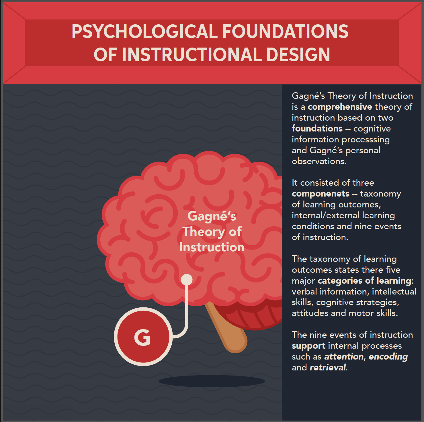
This is an example of the slide-out panel I designed, displaying content for the selected psychological foundation. I designed it so that when the learner has selected a specific point, the panel will slide out from the opposite direction of the chosen point. Additionally, I opted for a larger font size as it was easier to read, despite the comprehensive summary.
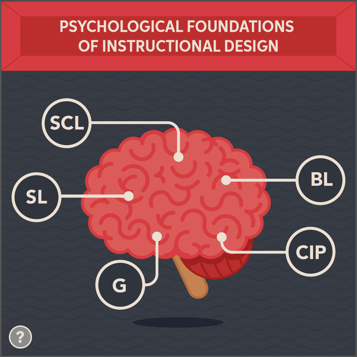
Here is the resulting user interface design and layout that I designed and elected. I chose this layout because it maximizes the design real estate by running the title across (as opposed to being constrained to the left as in previous design iterations). Similarly, I wanted the brain illustration to be center-aligned. I designed the interface with links to central points that arrive at different areas of the brain. Here, learners can be explorers and discover new information by rolling over the individual points to learn more.

This is an example of the pop-up directions I designed for the revised user interface design and layout. Further, I wanted the directions to be accessible from the lower left-hand corner when needed. This feature provides clear instruction prior to interacting with the theory chart and reduces cognitive load.
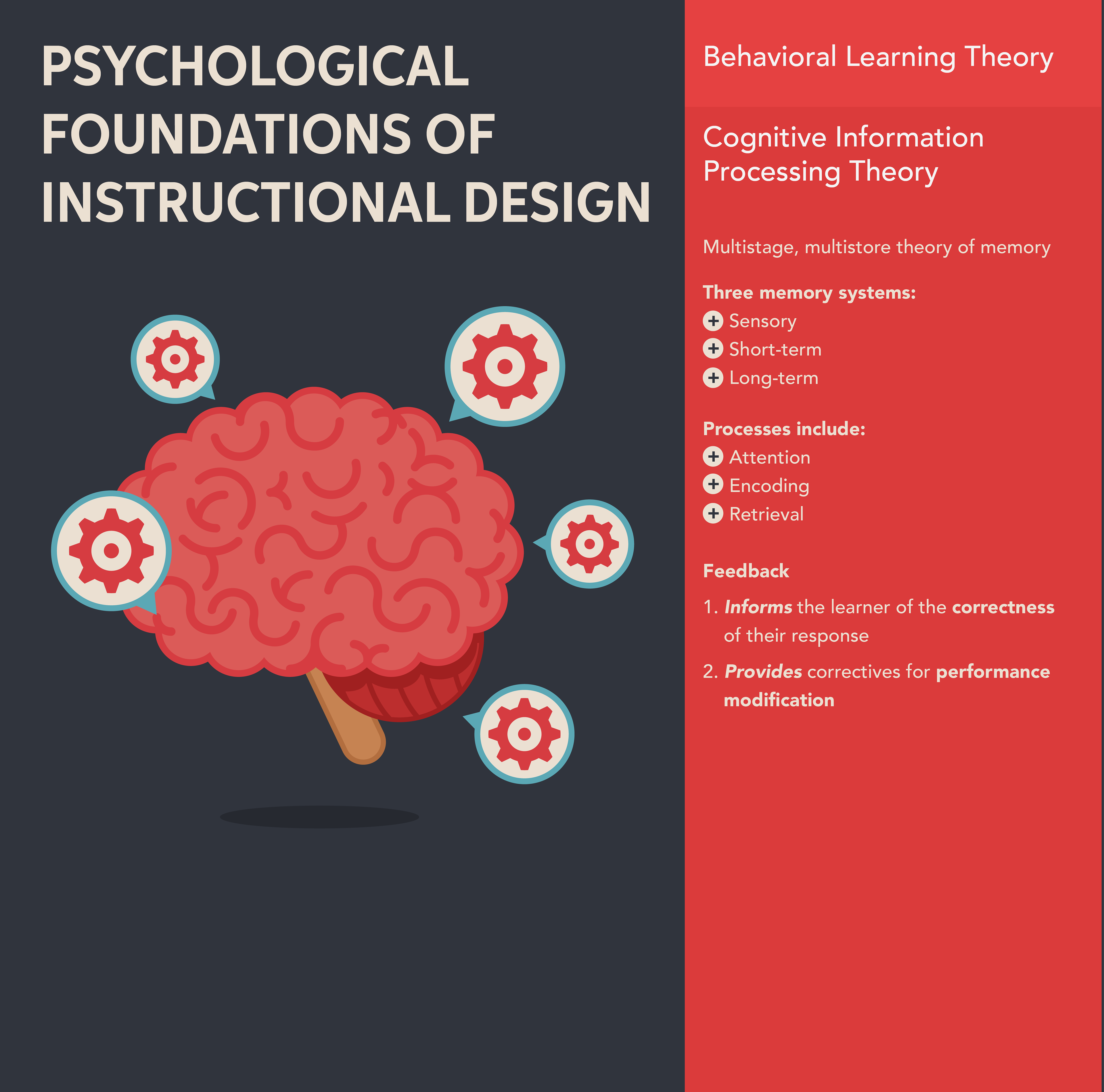
Here is an example of the original user interface design and layout of the learning theory chart. I decided that this user interface was not effective in maximizing the design space. It forced the type of the instructional content to remain small, and the layout did not allow the elements to breathe. In effect, the user interface was too busy. Moreover, I identified how the learner would have had difficulty reading, as well as, understanding where to begin.